Designing the Meridian mark
Notes on the Vyntel identity: why the mark is a disc with a curved V cut into it, how the palette was chosen, and why every logo file is generated from one geometry file.
, 4 min read. Filed under design, brand, vyntel.
Vyntel needed an identity that could sit above several products without competing with them. AgentPanes already had its forest and lime. Song Studio already had its warm dark palette and amber. The house mark had to be recognisable at 16 pixels, work in one colour, and stay out of the way. These are the notes from that work.
The brief
Three constraints shaped everything:
- The mark has to read as a "V" on its own, because the wordmark will often be absent.
- It has to survive being a favicon, an app icon, and a corner badge on a product page.
- It should say something about "software for the people of the world" without resorting to a globe illustration.
Four candidates
The idea that stuck was a disc with a V opened into it. The disc is the world. The V is Vyntel. The question was the shape of the V.
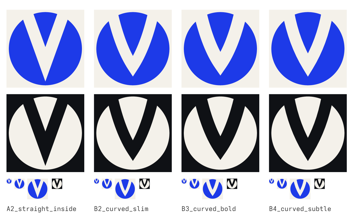
A straight V was the most legible at small sizes but looked like a generic letter badge. Curving the arms so they widen toward the top and meet at a point below the centre made the V read like two meridians converging at a pole. The bold curve was heavy at large sizes. The subtle curve, fourth from the left, kept the legibility of the straight version and the character of the curved one, so it became the mark.
One detail matters more than it looks: the point of the V stops inside the disc. If the cut ran out through the bottom, the disc would split into two wings and the circle would be lost.
Wordmark and lockup
The wordmark is set in Bricolage Grotesque SemiBold at optical size 48 with tracking tightened by three percent. It is outlined to vector paths, so no logo file depends on a font being installed. In the lockup the mark stands 1.3 times the cap height of the wordmark, with a gap of 0.45 cap heights between them.
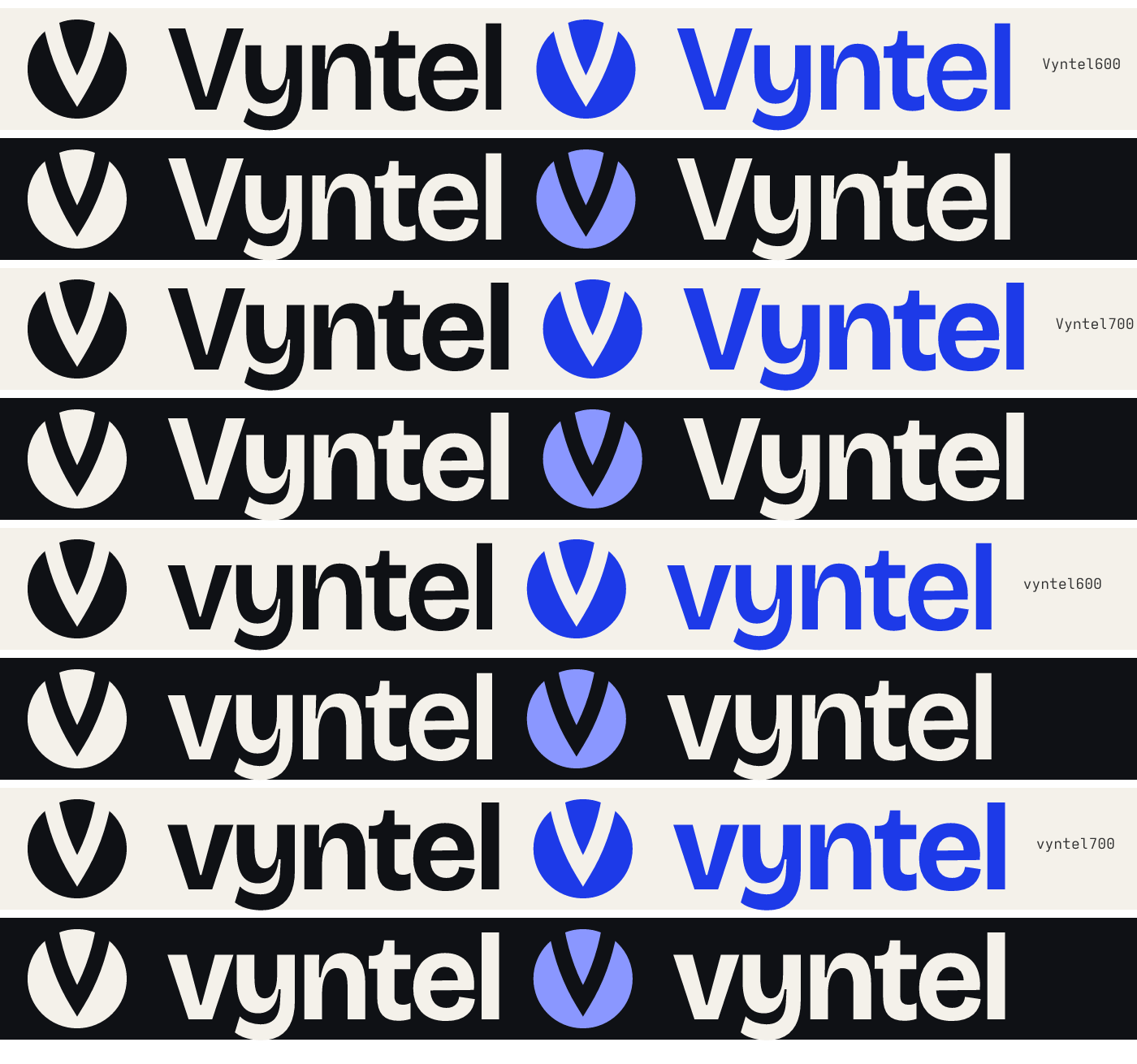
Capitalised "Vyntel" won over lowercase. The capital V echoes the mark and the word reads as a name rather than a command.
Paper, ink and one blue
The palette is deliberately small, and it was revised once. The first draft used a warm cream paper (#F4F1EA) with the blue on top. Three of the design guides we audit against name exactly that cream as the current default look of generated pages, so it went. The replacement is derived from Vyntel's own world: printed atlases, whose paper is bright and slightly cool, with black type and one blue for water and graticule.
Paper (#EFF2F7) is that cool bright white, tinted a little toward the blue. Ink (#12161D) is a near-black with the same cool undertone. Ultramarine (#2145CA) is the only brand colour, so wherever it appears it means Vyntel. In dark mode the accent lifts to a periwinkle (#8DAFFE) because the ultramarine does not clear contrast on ink. All of it is specified in OKLCH so that the tints stay consistent across the neutrals.
Every pairing was checked before it was adopted. Ultramarine on paper measures 6.8:1. Periwinkle on ink measures 9.1:1. Secondary text is 7.6:1 on paper and 8.5:1 on ink. All of that clears the WCAG AA threshold of 4.5:1 for body text.
One file, every asset
The whole identity lives in a single JSON file: the disc, the cut path, the wordmark outlines, the lockup proportions and the palette. A script reads that file and writes every SVG logo, every PNG, the favicons, the app icon and the social cards. If the geometry changes, the version number changes and everything is regenerated. Nothing is drawn twice by hand, and no asset can drift from the source.
A house of brands
Vyntel does not restyle its products. AgentPanes keeps its colours, Song Studio keeps its own. The house appears as "by Vyntel", the mark in the product's accent colour, and this site as the common home. The full rules, with downloadable files, are on the brand page.